Fiscal Cliff Navigation Tactics

Nov 20, 2012

  1. Earlier this year, Goldman Sachs’ Peter Oppenheimer said that compared to bonds, US stocks were the cheapest in 50 years.
  2. If Peter is correct, that could be good news for your gold stocks, because there is an ongoing correlation between the Dow and most gold equities.
  3. Unfortunately, Goldman also believes that the fiscal cliff situation could drive stock markets 8% lower by year-end.
  4. You are looking at the daily chart for the Dow, and you can see that it made a small top in mid-September. It has declined about 8% from the high.
  5. Gold stocks are more volatile than the Dow. GDX declined about 18%, during the period in which the Dow fell 8%. There is a lot of symmetry between these two charts.
  6. If the Dow is set to fall another 8% from the lows of last week, GDX could fall another 18% from its recent lows. That would put GDX at about $37, and below the May-July lows.
  7. Some of the largest gold companies are already trading near their summer lows, which is somewhat alarming.
  8. If you own a home, it is wise to purchase home insurance. If you own gold stocks, carrying some cash and short positions is a form of insurance. That’s the daily chart of DUST, which is effectively a triple-leveraged bet against GDX. The performance is calculated on a daily basis. I’m a buyer, moderately, in the $28 and $22 areas.
  9. What would happen to gold stocks, if Goldman Sachs is correct about the Dow falling another 8%, and then they called for an even harder fall, instead of a rally?
  10. The situation could get quite ugly. A small position in DUST may help gold stocks investors to professionally manage fiscal cliff fear.
  11. Gold recently sold off along with the other so-called “risk on” markets, but it bottomed quickly. The daily chart shows a nice head and shoulders bottom pattern in play.
  12. The daily gold chart looks superb. The H & S pattern sits near the demand line of a beautiful rising channel.
  13. HSR (horizontal support & resistance) at $1758 is the initial upside target, and then $1800. A “price pop” to the $1825 price zone could be a game changer for gold stocks.
  14. Silver looks even better than gold. Yesterday’s price action was important, because it took silver above the neckline of a head and shoulders bottom.
  15. At this point in time, gold has yet to rise above its neckline, so silver is clearly the leader.
  16. Silver seems eager to race to $35.50, and if gold can rise above $1800, that could catapult silver into the $40 range.
  17. There’s more good news. Ben Bernanke makes a speech in New York today, and he may give more hints about ramping up QE3. Currently, QE3 is being “diluted”, because the Fed is selling short term Treasuries.
  18. There are rumours that the Fed may cut back on that practice, or even halt it, before the end of the year. If “Big Ben” speaks boldly about ending the dilution of QE3, gold and silver could spike higher, very quickly.
  19. Most investors in the gold community like speculative resource stocks. If you are looking for action, my favourite play right now is the “Global X Gold Explorers” fund.
  20. At about $8 a share, the GLDX ETF is something that is probably priced “just right”, for action-oriented investors. In contrast, GDXJ is trading at about $22.
  21. It’s a lot easier to look down from $8, than it is from $22. Aggressive investors should considering accumulating GLDX on every 25 cent decline, inside the highlighted $7-$9.75 “price box”.
  22. I like both GDXJ and GLDX, but there’s no question that GLDX is a lot easier to handle, emotionally.
  23. A move above $1800 in gold could be the catalyst that takes GLDX above $10. From there, the target would be $13, which is about 50% higher than today’s price!
Indian Gold Demand Picks Up

Indian Gold Demand Picks Up

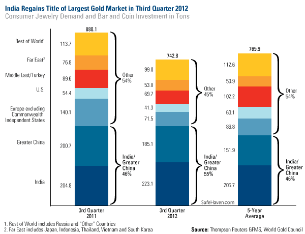
The love for gold has been reignited in India, according to the World Gold Council (WGC) in its Gold Demand Trends for the third quarter of 2012. India regained its title as the strongest performing market, overtaking the greater China area, as the country experienced a bounce-back in demand due to improved sentiment during the festival season.

Compared to the third quarter of last year, Indian gold jewelry demand grew by 7 percent while gold bar and coin demand rose 12 percent. Total consumer demand was 223 tons, compared to 205 tons this time last year. The second largest market was Greater China, which consumed 185 tons in the third quarter of 2012. This was less than the 201 tons consumed in the third quarter of last year.

Together these markets in the east made up 55 percent of the world’s jewelry and investment demand, according to the WGC. indian-gold

Although India experienced a setback earlier this year when gold shops boycotted a proposed tax on the yellow metal, imports recovered by July “as inventory levels were bolstered (aided by a well-timed dip in the local price) and the market adjusted to the customs duty,” says the WGC.

The third quarter has historically been a strong seasonal time for the Love Trade to come alive in the east. Monsoon rains and the festival season in the fall are generally associated with the buying and giving of gold. Still, for the year, don’t expect the Love Trade in India to be as strong as it was in 2011, as gold demand remains subdued with the ongoing weakness of the rupee.

Read More…

Continue reading

ETF (GOLD & US Dollar)

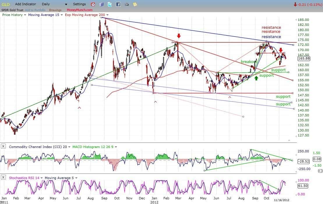
On its way down from 168, GLD broke its first support level and came to rest on the second (200-DMA) from which it had a bounce. Last week, I suggested that it might find some resistance on the small horizontal red trend line, which it has, and which caused it to pull back three points. It’s difficult to see how it could have much more of a decline right away if the market is going to have a mid-correction rally, so we can probably expect the near-term trend to turn up again, perhaps reaching the top channel line (blue) before rolling over again.

Gold Etf

If GLD does not have much of a rally from here – especially if the market does rally – it will be an indication that some decent weakness can be expected into the cycle low. In any case, subsequent action should form a P&F pattern which will help us determine the extent of the decline into the 25-wk cycle low.

UUP (dollar ETF)

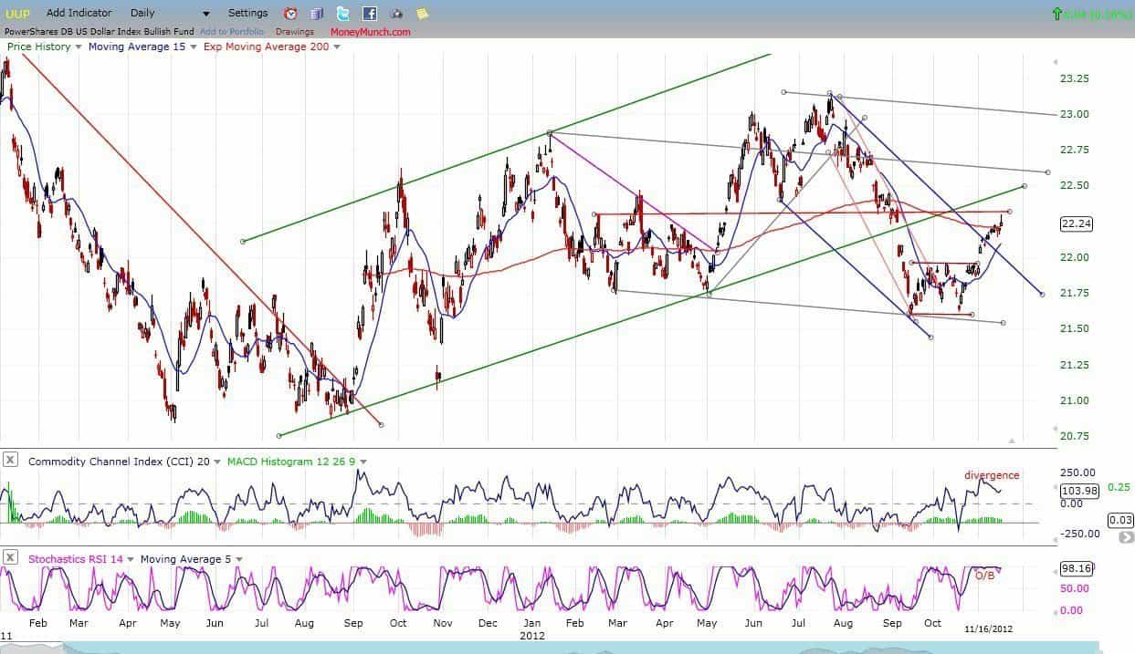
UUP normally goes against equities and gold. The index appears to be extended short-term and eady to pull-back. This can be seen in the indicators, one of which is very overbought and the other beginning to show some negative divergence. If a short-term top is forming, this should help the market to find a short-term low.

US Dollar ETC

Continue reading

S&P 500 Weekly Update

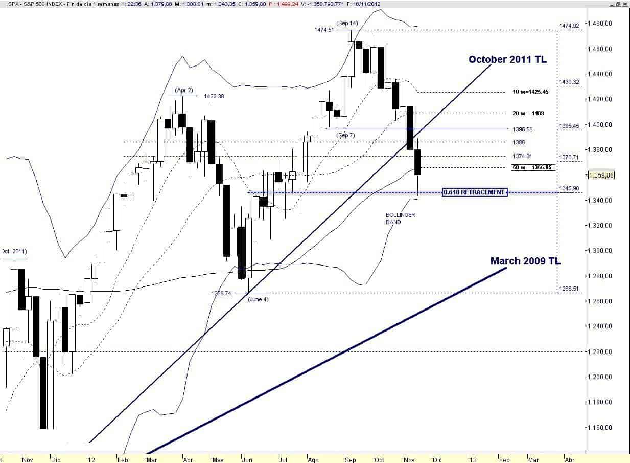
Last Friday I suggested that price was involved in unfolding a terminal pattern: “Maybe price is unfolding a Triangle that should establish a bottom with the last thrust down, who knows if at the 0.618 retracement the PPT will step in.”

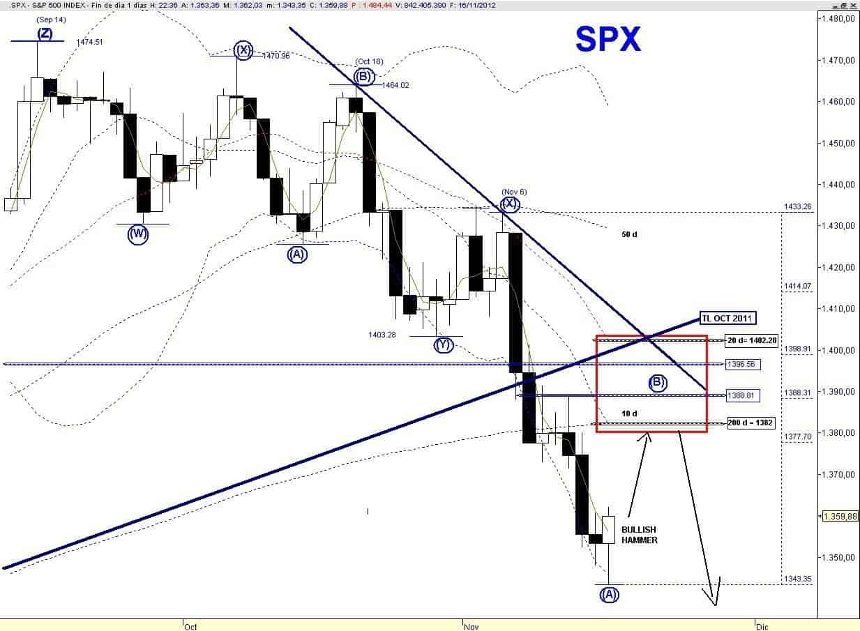
Instead of a Triangle price traced an Ending Diagonal, some good news came form Washington and price after testing the 0.618 retracement reversed to the upside, leaving in the daily chart a bullish hammer.

Therefore the wave structure off the November 6 peak is most likely over. This down leg, if my preferred count is correct, is the wave (A) of the last Zig Zag from the September 14 high. Therefore I am expecting a multi-day bounce followed by a lower low that should complete the corrective EWP (Recall that I am working with a Triple Zig Zag) from the September 14 high with positive divergences.

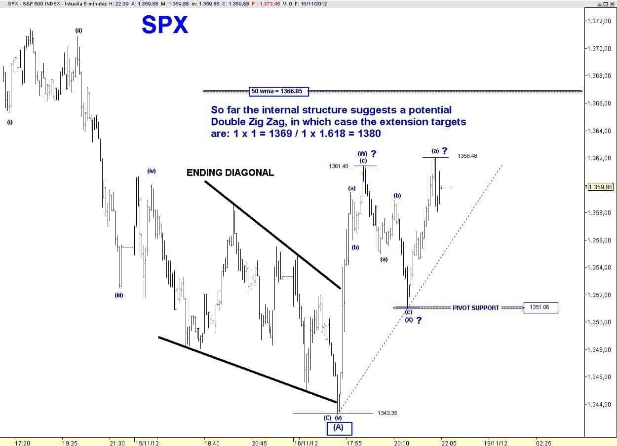
The internal structure of this bounce at the moment suggests that price may unfold a Double Zig Zag, in which case the common extension targets are:

1 x 1= 1369
1 x 1.618= 1380

A counter trend bounce always entails risks since the EWP can easily morph into something else, so next Monday I would like to see follow through to the upside or at least price should not breach the initial higher low at 1351.06.

In order to keep the ball running to the upside, bulls need price above the 50 wma = 1366.85 by next Friday, theoretically it looks like an easy task.

sp 500 chart

Therefore the extreme oversold readings of breadth & momentum Indicators + logical level for a short-term bottom (0.618 Retracement) + reversal pattern are the “ingredients” that should allow a multi-day rebound.

sp 500 weekend chart

In the daily chart below I highlight the target box for the assumed wave (B) countertrend bounce with a range 1382 – 1402.

A weak bounce should fail at the 200 dma while a strong one will go deeper inside the box and two trend lines resistance could come into play.

sp 500 weekly update chart

So the good news for the short-term bullish case is that there are enough technical reasons that auspicate a larger rebound.

But the negatives are still more overwhelming, since in addition to an incomplete EWP there is no sign of a major bottom from breadth-momentum indicator, VIX and sentiment.

Bulls also have the bullish seasonality of a shorter Thanksgiving week, while volume is expected to shrink.

In any case we know the two potential catalyst that are needed for the resumption of the intermediate up trend:

  • US political agreement of the “Fiscal Cliff”
  • Spanish Bailout

In addition since the Operation Twist ends in December, the next FOMC meeting on December 12 will be a major risk event and could be another detonator for a Major Bottom of the equity market.

To become a subscriber, subscribe to our free newsletter services. Our service is free for all.

Continue reading

Flag Trendline SP500 Update

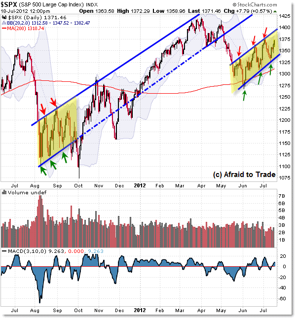
We’re hearing much talk about the potential Bear Flag pattern on the S&P 500 Daily Chart.

Let’s take a mid-week update on the pattern and note the current key price boundary levels to watch for clues.

First, here’s the S&P 500 Daily Chart trend-lines structure:

SP-500-Daily-Chart

Moving from right to left, we see the current “Bear Flag” consolidation pattern stretching from early June to present.

The lower rising trendline resides near 1,340 while the upper rising trendline continues near 1,390.  The 30-min chart below emphasizes these trendline levels.

Now, moving to the left of the chart, the last time we saw a similar Daily Chart ‘flag’ struture was from August to October 2011.

While price did break the downside trendline, the full downside target was NOT achieved due to a power-rally which developed off the 1,100 Index level.

From there, price structure continued to trade mostly in a “Creeper” uptrend, bound by the prior “flag” trendlines until the breakdown of May 2012.

To become a subscriber, subscribe to our free newsletter services. Our service is free for all.

Continue reading

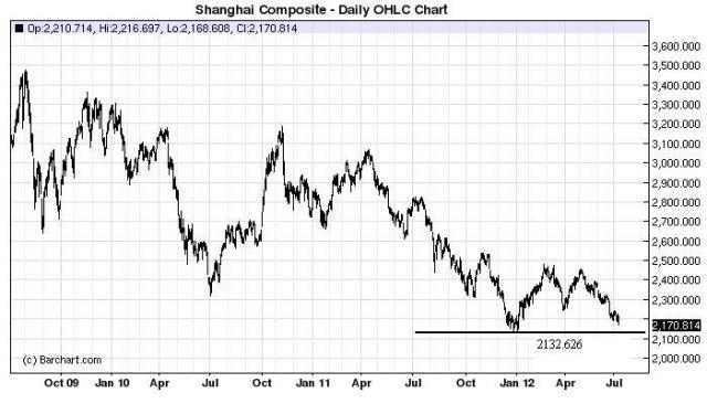
Shanghai Composite reached to Support

Shanghai-Composite

The Chinese government reported imports rose just 6.3 percent last month from a year earlier, less than half the 12.7 percent expected increase. No doubt this reflects softening domestic demand in the world’s second largest economy and one reason why commodities have been selling off.

Don’t you think the government has to be cooking up something big?

To become a subscriber, subscribe to our free newsletter services. Our service is free for all.

Continue reading