Dow Jones and S&P 500 have been started to fall down

“NEVER BEFORE HAVE YOU HAVE SEEN THIS PERFECTION OF CHART ANALYSIS

As expected, Dow Jones and S&P 500 have been started to fall down. Let’s start by looking Nifty future…, Yes we are waiting for long “Expected time is 2-3day for long” Click here.

Yes, You can short-sell Nifty for 5928-5947 small points. 

To become a subscriber, subscribe to our free newsletter services. Our service is free for all.

Continue reading

DJIA Weekly Technical View

Moving Avg-Exponential Indicator:

Conventional Interpretation: Price is above the moving average so the trend is up.

Trend: Market trend is UP.

Mov Avg 3 lines Indicator:

Note: In evaluating the short term, plot1 represents the fast moving average, and plot2 is the slow moving average. For the longer term analysis, plot2 is the fast moving average and plot3 is the slow moving average

Conventional Interpretation – Short Term: The market is bullish because the fast moving average is above the slow moving average.

Additional Analysis – Short Term: The market is EXTREMELY BULLISH. Everything in this indicator is pointing to higher prices: the fast average is above the slow average; the fast average is on an upward slope from the previous bar; the slow average is on an upward slope from the previous bar; and price is above the fast average and the slow average.

Conventional Interpretation – Long Term: The market is bullish because the fast moving average is above the slow moving average.

Additional Analysis – Long Term: The market is EXTREMELY BULLISH. Everything in this indicator is pointing to higher prices: the fast average is above the slow average; the fast average is on an upward slope from the previous bar; the slow average is on an upward slope from the previous bar; and price is above the fast average and the slow average.

Bollinger Bands Indicator:

Conventional Interpretation: The Bollinger Bands are indicating an overbought market. An overbought reading occurs when the close is nearer to the top band than the bottom band. 

Additional Analysis: The market appears overbought, but may continue to become more overbought before reversing. Given that we closed at a 45 bar new high, the chance for further bullish momentum is greatly increased. Look for some price weakness before taking any bearish positions based on this indicator.

Volatility Indicator: Volatility is in a downtrend based on a 9 bar moving average.

Momentum Indicator:  

Conventional Interpretation: Momentum (1000.11) is above zero, indicating an overbought market.


Additional Analysis: The long term trend, based on a 45 bar moving average, is UP. The short term trend, based on a 9 bar moving average, is UP. Momentum is indicating an overbought market, and appears to be slowing. A modest downturn is possible here. 

Rate of change Indicator: 

Conventional Interpretation: Rate of Change (7.69) is above zero, indicating an overbought market. 

Additional Analysis: The long term trend, based on a 45 bar moving average, is UP. The short term trend, based on a 9 bar moving average, is UP. Rate of Change is indicating an overbought market, and appears to be slowing. A modest downturn is possible here. 

Comm Channel Index Indicator: 

Conventional Interpretation: CCI (170.27) recently crossed above the buy line into bullish territory, and is currently long. This long position should be liquidated when the CCI crosses back into the neutral center region.

 Additional Analysis: CCI often misses the early part of a new move because of the large amount of time spent out of the market in the neutral region. Initiating signals when CCI crosses zero, rather than waiting for CCI to cross out of the neutral region can often help overcome this. Given this interpretation, CCI (170.27) is currently long. The current long position position will be reversed when the CCI crosses below zero. Adding bullish pressure the market just reached a 45 bar new high.

 RSI Indicator: 

Conventional Interpretation: RSI is in neutral territory. (RSI is at 66.70). This indicator issues buy signals when the RSI line dips below the bottom line into the oversold zone; a sell signal is generated when the RSI rises above the top line into the overbought zone.

Additional Analysis: RSI is somewhat overbought (RSI is at 66.70), but given the 45 bar new high here, greater overbought levels are likely. 

MACD Indicator: 

Conventional Interpretation: MACD is in bullish territory, but has not issued a signal here. MACD generates a signal when the FastMA crosses above or below the SlowMA. 

Additional Analysis: The long term trend, based on a 45 bar moving average, is UP. The short term trend, based on a 9 bar moving average, is UP. MACD is in bullish territory. And, the market just put in a 45 bar new high here. Look for more new highs. 

Open Interest Indicator: No open interest value in the database for this bar. Note: Open interest not available for all data types. 

Volume Indicator: 

Conventional Interpretation: The current new high is not accompanied by increasing volume, suggesting that the current move lacks broad participation. Look for a retracement soon.  

Additional Analysis: The long term market trend, based on a 45 bar moving average, is UP. The short term market trend, based on a 5 bar moving average, is UP.The current new high is not accompanied by increasing volume, suggesting that the current move lacks broad participation and the market may be overbought. A retracement is possible here.  

Stochastic – Fast Indicator:  

Conventional Interpretation: The stochastic is in overbought territory (SlowK is at 96.91); this indicates a possible market drop is coming. 

Additional Analysis: The long term trend is UP. The short term trend is UP. Even though the stochastic is signaling that the market is overbought, don’t be fooled looking for a top here because of this indicator. The stochastic indicator is only good at picking tops in a Bear Market (in which we are not). Exit long position only if some other indicator tells you to. 

Stochastic – Slow Indicator:  

Conventional Interpretation: The stochastic is in overbought territory (SlowK is at 94.33); this indicates a possible market drop is coming. 

Additional Analysis: The long term trend is UP. The short term trend is UP. Even though the stochastic is signaling that the market is overbought, don’t be fooled looking for a top here because of this indicator. The stochastic indicator is only good at picking tops in a Bear Market (in which we are not). Exit long position only if some other indicator tells you to.  

Swing Index Indicator:  

Conventional Interpretation: The swing index is most often used to identify bars where the market is likely to change direction. A signal is generated when the swing index crosses zero. No signal has been generated here.

 Additional Analysis: No additional interpretation.

Important: This commentary is designed solely as a training tool for the understanding of technical analysis of the financial markets. It is not designed to provide any investment or other professional advice.

Continue reading
Japan Market Following in US Footsteps

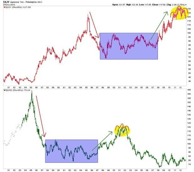
Japan is following in the footsteps of the man who laid the groundwork for the greatest global inflationary operation of the modern era. We see the Yen in the top panel of the chart below forming a similar pattern to that which USD made from 2000 to 2002 as an epic bubble in credit expansion was being fomented in the US.

japan-market-folow-usa

The similarity in the charts (with a decade stagger) is striking and it is probably no coincidence that Japan has chosen to leverage its currency – which had been chronically strong since the 2007 beginnings of the US-triggered global financial meltdown – just as the US did with the once strong ‘King’ dollar in and around 2001.

Continue reading

S&P 500, Inverse “Head and Shoulders” Pattern Continues to Play Out as Heavy Week of Economic Data Begins

The first week of the month is always the most interesting, with global purchasing managers indexes, U.S. ISM’s, and employment data released.  Overnight we see continued weakness in Europe’s economic data and perhaps some more “green shoots” in China.   Europe is sporting “beige shoots” at it is reaching the stage where things are so bad it is difficult to go down further.

  • Euro-zone manufacturing activity contracted for the ninth consecutive month in November, albeit at a slower pace than in October. Markit’s Eurozone manufacturing Purchasing Managers Index (PMI) rose to 46.2 in November from October’s 45.4, though it stayed below the 50 mark dividing growth from contraction for the 16th straight month.
  • The new export orders index was revised up to 46.4 from the preliminary reading of 45.9 two weeks ago, and it now reads more than a full point higher than the October reading.
  • Manufacturing accounts for around a quarter of the euro zone’s private economy and is dwarfed by a services sector that fared badly in November, the data two weeks ago showed.

China seems to be “recovering” not due to the private sector, but government led:

  • The final reading for the HSBC Purchasing Managers’ Survey (PMI) rose to 50.5 in November from 49.5 in October, in line with a preliminary survey published late last month. It was the first time since October 2011 that the survey crossed above 50 points, the line that demarcates accelerating from slowing growth.
  • An official PMI survey of China’s non-manufacturing sectors also ticked up, to 55.6 in November from 55.5 in October, led by expanded activity in construction services. But growth in air and rail transport and food and beverages both slowed.
  • Growth accelerated for large firms for the third month in a row, but medium and smaller companies saw a retrenchment, with the decline more pronounced for the smaller firms, the NBS said in a not accompanying its official manufacturing PMI survey. “The improving numbers are mostly because of government investment,” said Dong Xian’an, economist with Peking First Advisory, referring to the official PMI.

As for the U.S. we have ISM Manufacturing this morning at 10 AM; consensus for 51.7 – flat with last month.  Construction spending also hits at 10 AM – expectation 0.4% growth.

Wednesday ADP employment which hopefully with some recent changes is “somewhat” closer to government data on a month-to-month data (before revisions) – expectations of 125K versus 158K.  Sandy should be an issue.  ISM Non Manufacturing, expectations of a drop to 53.6 versus 54.2.

Friday is the much watched (Jack Welch) employment report – expectations of only 80K versus last month’s 171K, again Sandy impacts here.  Unemployment rate expected up to 8.0% versus 7.9%.


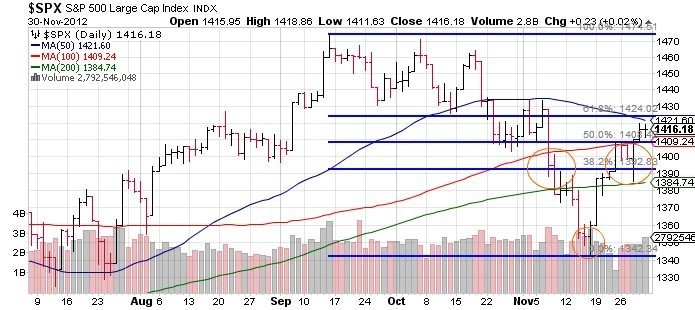
As for the technical picture, we have a gap up this morning on any myriad of “positive” news items – China PMI (despite China stock market falling yet again), European PMI not getting worse (European markets acting WELL), or Spain asking for bailout funds for its banks (no surprise, but algos read the headline and futures popped).  Evidence continues to mount for a continuation of an inverse “head and shoulders” bottom move; if this continues there should be a move to the mid 143os to upper 1440s (depending on what you use for the head and neckline – up for some interpretation).   Now if that happens this would create the first “higher high” in the S&P 500 since the correction began in mid-September, but if that is all the move has in it would be a particularly nasty spot to reverse since everyone would say “a new high” and the trend is changed.   But we’ll see – this market has become famous since 2009 for “V shaped” moves that continue in one direction (not the boy band) without relent so the talk of “performance chasing” and “underinvested longs” and “repeatedly scarred shorts” should be relentless over S&P 1435.

At the time I write this the S&P 500 is gapping up to the 61.8% retrace of the entire two month correction.  As posted Friday, the ability for the market to move sideways to consolidate gains was a positive – so the corrections in this move up have come mostly via time rather than price.

sp-500-Head-and-Shoulders

Continue reading

Fiscal Cliff Navigation Tactics

Nov 20, 2012

  1. Earlier this year, Goldman Sachs’ Peter Oppenheimer said that compared to bonds, US stocks were the cheapest in 50 years.
  2. If Peter is correct, that could be good news for your gold stocks, because there is an ongoing correlation between the Dow and most gold equities.
  3. Unfortunately, Goldman also believes that the fiscal cliff situation could drive stock markets 8% lower by year-end.
  4. You are looking at the daily chart for the Dow, and you can see that it made a small top in mid-September. It has declined about 8% from the high.
  5. Gold stocks are more volatile than the Dow. GDX declined about 18%, during the period in which the Dow fell 8%. There is a lot of symmetry between these two charts.
  6. If the Dow is set to fall another 8% from the lows of last week, GDX could fall another 18% from its recent lows. That would put GDX at about $37, and below the May-July lows.
  7. Some of the largest gold companies are already trading near their summer lows, which is somewhat alarming.
  8. If you own a home, it is wise to purchase home insurance. If you own gold stocks, carrying some cash and short positions is a form of insurance. That’s the daily chart of DUST, which is effectively a triple-leveraged bet against GDX. The performance is calculated on a daily basis. I’m a buyer, moderately, in the $28 and $22 areas.
  9. What would happen to gold stocks, if Goldman Sachs is correct about the Dow falling another 8%, and then they called for an even harder fall, instead of a rally?
  10. The situation could get quite ugly. A small position in DUST may help gold stocks investors to professionally manage fiscal cliff fear.
  11. Gold recently sold off along with the other so-called “risk on” markets, but it bottomed quickly. The daily chart shows a nice head and shoulders bottom pattern in play.
  12. The daily gold chart looks superb. The H & S pattern sits near the demand line of a beautiful rising channel.
  13. HSR (horizontal support & resistance) at $1758 is the initial upside target, and then $1800. A “price pop” to the $1825 price zone could be a game changer for gold stocks.
  14. Silver looks even better than gold. Yesterday’s price action was important, because it took silver above the neckline of a head and shoulders bottom.
  15. At this point in time, gold has yet to rise above its neckline, so silver is clearly the leader.
  16. Silver seems eager to race to $35.50, and if gold can rise above $1800, that could catapult silver into the $40 range.
  17. There’s more good news. Ben Bernanke makes a speech in New York today, and he may give more hints about ramping up QE3. Currently, QE3 is being “diluted”, because the Fed is selling short term Treasuries.
  18. There are rumours that the Fed may cut back on that practice, or even halt it, before the end of the year. If “Big Ben” speaks boldly about ending the dilution of QE3, gold and silver could spike higher, very quickly.
  19. Most investors in the gold community like speculative resource stocks. If you are looking for action, my favourite play right now is the “Global X Gold Explorers” fund.
  20. At about $8 a share, the GLDX ETF is something that is probably priced “just right”, for action-oriented investors. In contrast, GDXJ is trading at about $22.
  21. It’s a lot easier to look down from $8, than it is from $22. Aggressive investors should considering accumulating GLDX on every 25 cent decline, inside the highlighted $7-$9.75 “price box”.
  22. I like both GDXJ and GLDX, but there’s no question that GLDX is a lot easier to handle, emotionally.
  23. A move above $1800 in gold could be the catalyst that takes GLDX above $10. From there, the target would be $13, which is about 50% higher than today’s price!

ETF (GOLD & US Dollar)

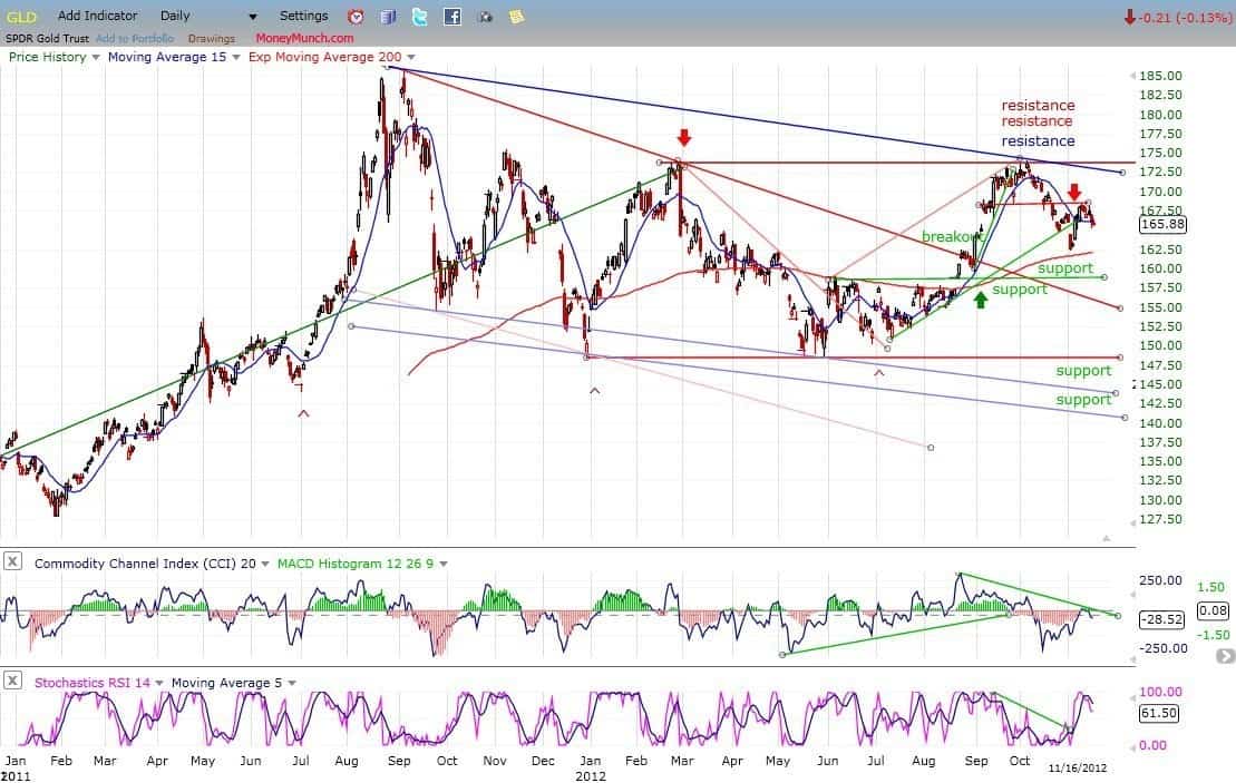
On its way down from 168, GLD broke its first support level and came to rest on the second (200-DMA) from which it had a bounce. Last week, I suggested that it might find some resistance on the small horizontal red trend line, which it has, and which caused it to pull back three points. It’s difficult to see how it could have much more of a decline right away if the market is going to have a mid-correction rally, so we can probably expect the near-term trend to turn up again, perhaps reaching the top channel line (blue) before rolling over again.

Gold Etf

If GLD does not have much of a rally from here – especially if the market does rally – it will be an indication that some decent weakness can be expected into the cycle low. In any case, subsequent action should form a P&F pattern which will help us determine the extent of the decline into the 25-wk cycle low.

UUP (dollar ETF)

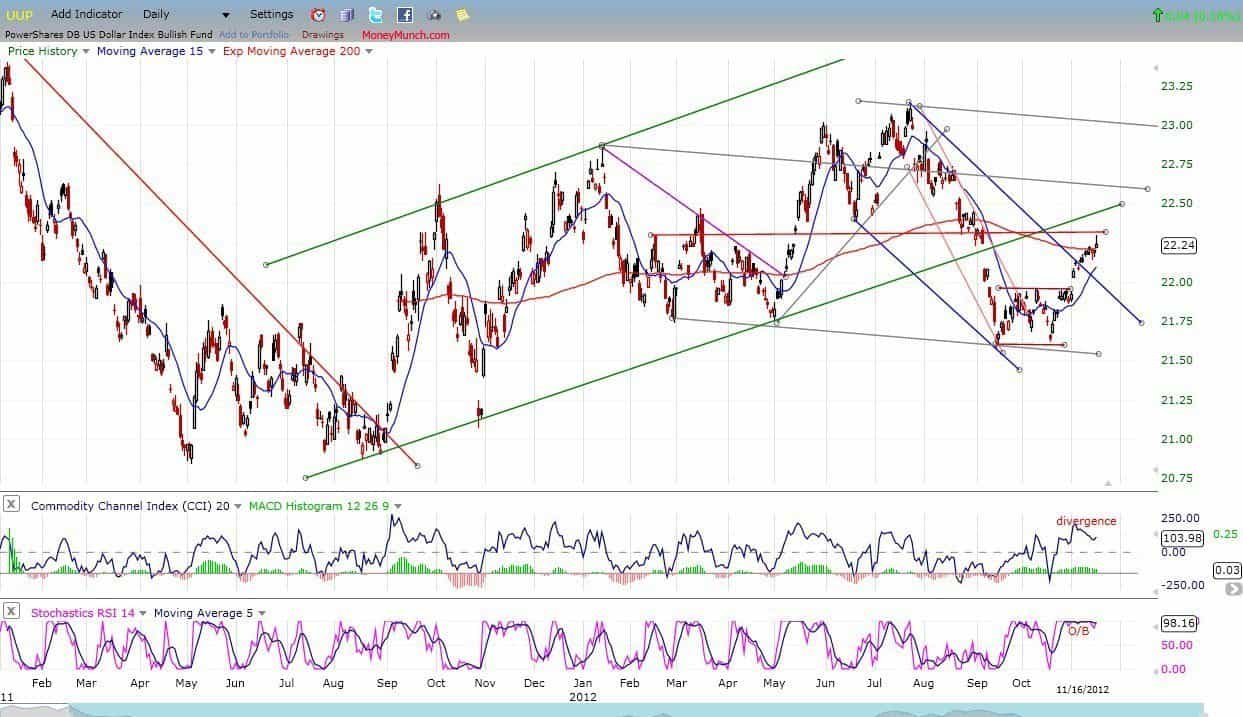
UUP normally goes against equities and gold. The index appears to be extended short-term and eady to pull-back. This can be seen in the indicators, one of which is very overbought and the other beginning to show some negative divergence. If a short-term top is forming, this should help the market to find a short-term low.

US Dollar ETC

Continue reading